Silvia Carreño
Lead Designer — Editorial coaching landing page for a Latina entrepreneur in Europe
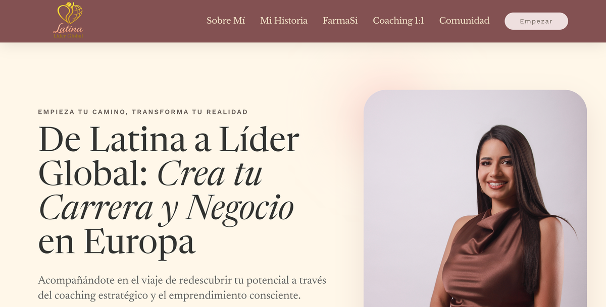
Role & Setup
Lead designer + strategist for a 2-week sprint
Silvia approached me with a brief: she needed a digital home that would speak to Latina women in Europe with warmth, professionalism, and editorial sophistication — for both her coaching practice and her FarmaSi business. I owned the project end-to-end: research, art direction, UX, UI, copy direction, and dev handoff.
My Role
Lead Designer & Strategist
Single point of accountability: brand strategy, IA, UX, UI, microcopy, and production. Direct partnership with Silvia on every decision.
Build Model
Solo designer × AI eng pair
Two-week sprint: I drove every design call, AI accelerated research synthesis, copy variants, and production-ready HTML/CSS scaffolding.
What I Owned
- Audience research & positioning
- Information architecture (7 sections)
- Brand identity & visual direction
- End-to-end UX & UI
- Editorial copy direction
- Responsive HTML/CSS production
- Calendly & WhatsApp CTA integration
Honest scope note: Silvia provided her own photography, business credentials, and product copy for FarmaSi. I did not handle hosting, domain configuration, or post-launch ad campaigns — only the design and deployable code.
The Why
A digital home for Latinas living between two worlds
Silvia is Colombian, based in the Netherlands, and her audience are Latina women navigating life and careers in Europe — a niche where most "coaching landing pages" feel either too corporate (cold European SaaS templates) or too cliché (Wix templates with stock images of smiling women).
The brief was specific: build something that feels like opening a beautifully curated magazine, conveys trust and warmth in equal measure, and guides visitors naturally toward two distinct CTAs — Calendly bookings for 1:1 coaching and WhatsApp joins for the community.
Overview
What was built
A bilingual editorial landing page positioning Silvia as a coach, FarmaSi entrepreneur, and community builder — with conversion paths designed for two distinct audiences, all in a magazine-style layout that felt warm, credible, and unmistakably Latina.
In Context
The landing in one frame
Editorial layout with photo card hero, magazine-style narrative sections, warm rose & cream palette, and serif-led typography that feels like a printed page brought to digital life.
Color & Typography
Warm rose meets editorial serif
The palette is anchored by a warm rose conveying trust and femininity, balanced with cream backgrounds that feel like quality paper stock. Serif headlines add editorial gravitas; sans-serif labels keep the UI functional and modern.
Headlines — Newsreader
De Latina a Líder Global
Serif · Elegant · Editorial authority
Labels — Work Sans
Empieza tu camino
Sans-serif · Uppercase · Functional
Accents — Libre Baskerville Italic
"El éxito no es solo lo que logras..."
Serif italic · Quotes & emotional moments
Sections Designed
Seven sections, one cohesive narrative
Each section is a chapter in Silvia's story — designed to guide visitors from inspiration to action without feeling salesy.
Hero
Full-width hero with photo card (48px radius, soft shadow), editorial headline «De Latina a Líder Global», dual pill-shaped CTAs.
✦ Photo CardQuote Break
Full-bleed gradient (cream → soft pink) with centered italic Newsreader quote — an editorial «page-turn» moment.
✦ Gradient DividerAbout / Bio
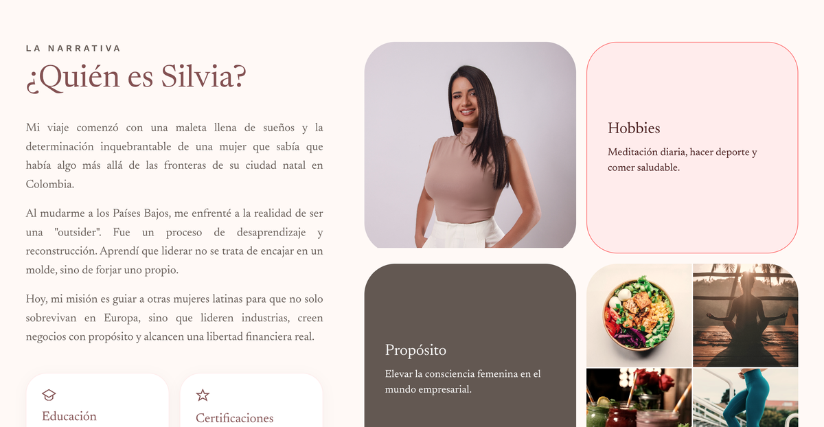
Two-column narrative bio + credential cards (Education, Certifications) + 2×2 grid for Purpose & Hobbies.
✦ CredibilityWhy I Started
Centered story card with heart icon, personal narrative about burnout recovery, italic pull-quote for emotional resonance.
✦ Story CardFarmaSi
Split layout: pink content card with feature icons (Apoyo, Escalabilidad, Libertad) + product image with floating gradient badge showing global ranking.
✦ Feature BadgeCoaching 1:1
Three-column card grid with icon circles, checklist features, hover-lift animations — each card a coaching tier.
✦ Service CardsCommunity & Footer
Dark card with large typographic tags («Comunidad», «Latinas», «Europa»), WhatsApp button, community image, warm rose footer.
✦ WhatsApp CTADecisions & Tradeoffs
Three calls where the obvious answer was wrong
Every design call is a tradeoff. Here are three places where the easy answer would have hurt Silvia's positioning, and the rationale for what I shipped instead.
What language does the page speak in?
Option A
Bilingual EN + ES toggle
Broader reach but feels less rooted — the cultural intimacy gets diluted in the toggle UI.
Option B
Spanish only, all the way
Authentic but narrows audience; some product names (FarmaSi) and CTAs read better in their native form.
Chosen · C
Spanish primary, EN where it adds editorial flair
Body copy in Spanish; product/brand names stay native (FarmaSi, «Comunidad Global»); editorial italics add literary tone.
Why C: Silvia's audience is bicultural — they live between languages. The page should sound like that audience speaks, not like a corporate translation. Native Spanish carries the warmth; selective English adds the cosmopolitan layer.
How prominently should we feature the FarmaSi business?
Option A
Front-and-center in hero
Maximizes commercial signal but reads like an MLM landing — kills the coaching credibility.
Option B
Hide it entirely
Cleaner brand but loses a real revenue stream — and a real story about entrepreneurship.
Chosen · C
Section 5 framed as «Comunidad»
Sells the lifestyle and ranking proof, not the MLM mechanic. Visual: product card with global ranking badge.
Why C: Coaching builds trust through credentials and warmth (sections 1–4). FarmaSi enters mid-page with the credibility already established — it reads as «another success story», not as the headline.
How many CTAs and where do they live?
Option A
One huge Calendly button everywhere
Clear path but pushy; ignores that some users want community first, coaching later.
Option B
5 different CTAs scattered
Too much choice = decision fatigue. Conversion drops.
Chosen · C
Two parallel paths, contextual placement
Calendly (1:1 coaching) and WhatsApp (community). Each section ends with the relevant CTA for that audience.
Why C: Coaching seekers and community seekers have different commitment thresholds. Forcing a calendar booking on someone who just wants to lurk a WhatsApp group kills both conversions. Two paths respect both intents.
Status & Measurement
What shipped and how I would evaluate it
Silvia's landing is live. Rather than claim results that were not measured, this section separates the delivered scope from a proposed evaluation plan.
Shipped · Scope Metrics
What was built & delivered in 2 weeks
- 7Distinct narrative sections, each with its own emotional purpose
- 2Distinct conversion paths (Calendly + WhatsApp), each contextually placed
- 3Type families: Newsreader (headlines), Work Sans (UI), Libre Baskerville (italic accents)
- 6Color tokens forming the warm-rose editorial system
- 44px+Touch targets on primary CTAs, designed toward WCAG 2.1 AA guidance
- 3Responsive breakpoints designed for mobile, tablet, and desktop
Proposed Evaluation
The five bets the landing is making
Test whether the magazine-style layout and photo-card hero encourage visitors to continue reading.
Target: median time-on-page > 90s · Measure with: GA4 engagementPill-shaped CTAs above the fold + repeated contextual placement drive coaching session bookings.
Target: > 2.5% visitor → Calendly click rate · Measured via: GA4 events + CalendlyThe dark community section with typographic tags converts «lurkers» into the WhatsApp group — lower commitment, higher join rate.
Target: > 6% visitor → WhatsApp click rate · Measured via: link trackingMid-page placement of the FarmaSi section (after credibility is built) generates qualified inquiries — not MLM-skeptic bounces.
Target: > 40% scroll-depth past section 5 · Measured via: Hotjar scroll heatmapTest whether responsive layouts and 44px touch targets support the two conversion paths effectively on mobile.
Target: mobile conversion rate >= 80% of desktop · Measure with: device-segmented funnelMeasurement Plan
How I would evaluate it
- Day 30Quantitative read on H1 & H2 + 5 user-test recordings
- Day 60Community growth (H3) + scroll heatmap analysis (H4)
- Day 90Mobile/desktop parity review (H5) + iteration plan
Suggested Tools
Stack for future evidence
Funnels for booking + community joins, heatmaps for layout validation, Maze for unmoderated 5-second tests on hero.
Design Reflection
Why this project mattered
The central design challenge was not choosing between warmth and credibility. It was creating an editorial system where both could coexist, while giving coaching and community audiences clear paths to act.
AI-Enhanced Workflow
How AI supported a two-week design and production sprint
The premise
AI supported research organization, copy exploration, and production during the two-week sprint. It did not replace design judgment or strategic thinking. I made the product, brand, and experience decisions and reviewed every output before it became part of the final page.
Discovery & Audience Research
Helped organize the client brief, audience inputs, and possible content patterns.
Worked directly with Silvia to define the audience, positioning, and voice, then reviewed every suggestion for cultural nuance and accuracy.
Visual System & Brand
Generated palette options around «warm trust» brief; suggested editorial type pairings.
Every taste call: final rose hex, type combination (Newsreader × Work Sans × Libre Baskerville), spacing rhythm, photo card radius.
Copy Direction & Microcopy
Generated 6 headline variants per section, alternative CTA copy in Spanish, Italian punctuation patterns.
Worked directly with Silvia to refine her voice; rewrote AI drafts to sound like her, not like ChatGPT-Spanish.
Production Code & Launch
Scaffolded responsive HTML/CSS from Figma specs, generated Calendly & WhatsApp embed snippets, drafted SEO meta.
Refined every interaction (hover-lifts, gradient dividers, pill CTAs), QA on 6 viewports, launched and connected to Silvia's domain.