Sonrisa Group
Lead Designer — Website & brand experience for a B2B SaaS consulting firm
Role & Setup
Lead designer for a 2-week sprint
Sonrisa Group came to me needing a website that could earn the trust of enterprise B2B SaaS clients without losing the warmth their name («Sonrisa» = smile in Spanish) implies. I owned the project end-to-end: brand strategy, IA, UX, UI, accessibility audit, and production-ready code.
My Role
Lead Designer & Strategist
Single point of accountability across 2 pages: brand voice, IA, UX, UI, motion direction, accessibility, dev handoff.
Build Model
Solo designer × AI eng pair
Two-week sprint. I drove every product call; AI accelerated palette exploration, copy variants, and Tailwind component scaffolding.
What I Owned
- Brand positioning & voice
- Information architecture (Landing + Services)
- Visual system & motion direction
- End-to-end UX & UI
- Wave SVG dividers & canvas hero
- Accessibility review against WCAG 2.1 AA guidance
- Responsive HTML/CSS/JS production
Honest scope note: Sonrisa's team handled their own service offerings copy and brand Spanish translations. I did not handle paid acquisition, CRM integration, or post-launch ad campaigns — only design and deployable code.
The Why
How a consulting firm earns trust without going cold
The B2B SaaS consulting market is full of two extremes: cold corporate sites that read like enterprise brochures, or scrappy startup sites that don't earn enterprise dollars. Sonrisa needed a third path.
The brief was specific: convey deep technical credibility for high-growth SaaS clients, protect the warmth behind their brand name (Sonrisa = smile), and drive qualified inquiries — without feeling salesy. The challenge: thread that needle in a single visual system.
Overview
What was built
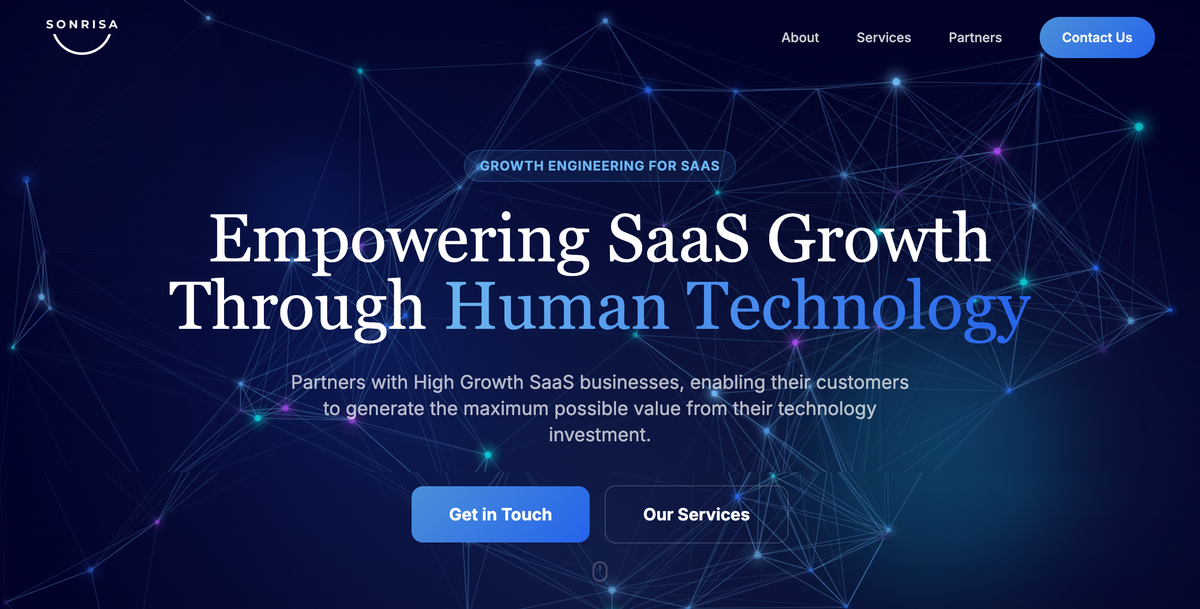
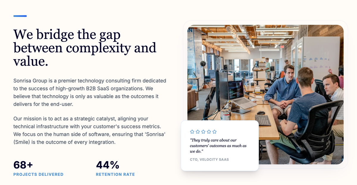
A full website (Landing + Services pages) with a deliberate emotional arc: dark navy hero that commands authority, transitioning through wave dividers into warm cream sections that invite reading. Animated canvas, counter animations, and accessibility baked in from the first sprint day.
In Context
Dark navy hero, warm cream body
An immersive dark hero with animated canvas + floating glow blobs creates first impact. Custom SVG wave dividers transition smoothly into warm cream content sections that invite a slower read.
Color & Typography
Navy depth meets warm cream
The palette is anchored by a deep navy that conveys authority and trust, balanced with warm cream that prevents the corporate coldness common in enterprise SaaS. Strategic blue accents guide the eye toward calls to action.
Headlines — Lora
The Human Side
Serif · Brushed curves · Gravitas with warmth
Body — Inter
Clean & Legible
Sans-serif · Open apertures · Tall x-height for screen reading
Sections Designed
Six sections, one cohesive emotional arc
Each section was designed to guide the visitor from initial impact to conversion, with a deliberate emotional shift from authority (dark hero) to approachability (cream body) to action (gradient CTA).
Hero with Animated Canvas
Full-viewport dark hero with particle animation, floating glow blobs, and gradient text. Two CTA buttons drive conversion above the fold.
✦ Animated CanvasServices Grid
4-column card grid with icon badges, subtle borders, and hover-lift animations. Each card is a clear entry point to a capability.
✦ Card GridAbout Section
Counter-animated statistics (150+ projects, 98% retention) paired with narrative about the company's mission and culture.
✦ Counter AnimationPartners & Trust
Logo strip with subtle grayscale-to-color hover effect, providing enterprise social proof and trust signals at a glance.
✦ Trust StripCTA Section
Dark navy contact section with gradient-bordered CTA button, creating a strong visual endpoint that drives inquiries.
✦ Gradient CTAFooter
Clean footer with navigation, contact info, and social icons — consistent with the dark-to-light brand language throughout.
✦ Brand FooterDecisions & Tradeoffs
Three calls where the obvious answer was wrong
Every design call is a tradeoff. Here are three places where the safe answer would have hurt Sonrisa's positioning, and the rationale for what I shipped instead.
How dark should the brand actually be?
Option A
All dark, all the time
Maximum authority, but reads as cold corporate — loses the «Sonrisa» warmth completely.
Option B
All light cream, soft brand
Warm and friendly, but loses the technical credibility B2B SaaS buyers need to take a consultancy seriously.
Chosen · C
Dark hero → cream body via wave dividers
First 100vh = dark navy authority. Wave dividers transition into cream body for readability and warmth.
Why C: Trust is built in two beats: first impact (hero needs to feel serious) + reading time (body needs to feel inviting). One palette can't do both. The wave divider is the literal handoff from authority to warmth.
How much motion is too much?
Option A
Heavy: video bg, parallax, 3D
Looks impressive in a portfolio shot, but kills page weight (LCP > 4s) and excludes lower-end devices.
Option B
Static, zero motion
Fastest possible load, but B2B SaaS buyers compare you to Linear / Vercel — no motion = looks dated.
Chosen · C
Lightweight canvas particles + counter + hover-lift
Three motion elements only. Each < 5kb JS, GPU-accelerated, respects prefers-reduced-motion.
Why C: Motion is a credibility signal in 2026 B2B, but only if it's purposeful. Canvas particles signal «modern technical» in the hero; counter animation rewards scroll; hover-lift teaches interactive affordance. No more, no less.
Where do accessibility tradeoffs land?
Option A
WCAG AAA, max contrast everywhere
Highest accessibility but kills the warm cream/blue subtleties; the brand starts to look generic.
Option B
Skip a11y, focus on look
Visually rich, but excludes ~15% of enterprise users (and most enterprise procurement requires AA).
Chosen · C
Accessible interactions, expressive brand surfaces
Body text and CTAs were tested against AA contrast criteria, while decorative gradients preserved the brand identity. Primary touch targets were designed at 44px or larger.
Why C: The goal was to protect readability, keyboard access, and clear interaction states without removing the visual character that differentiated the brand.
Status & Measurement
What shipped and what I would measure next
Sonrisa's site is live. I did not receive a complete post-launch analytics report, so I separate the delivered scope from the outcomes I would evaluate next.
Shipped · Scope Metrics
What was built & delivered in 2 weeks
- 2Production pages: Landing + Services, fully responsive across 4 breakpoints
- 6Distinct sections per page, each with its own emotional purpose
- 3Motion patterns: canvas particles, animated counters, and hover feedback
- A11yContrast, focus states, semantic HTML, reduced-motion support, and 44px primary touch targets
- 6Color tokens forming the navy & cream system; 2 type families (Lora + Inter)
Future Evaluation
What I would measure next
- TrustWhether the hero communicates technical credibility and warmth
- ExploreHow far visitors move through the Services page and which capabilities they view
- InquiriesQualified contact-form submissions and the pages that lead to them
- QualityPerformance, accessibility, and motion behavior across devices
- MobileHow mobile inquiry completion compares with desktop
Client Reflection
Why this matters to Sonrisa
Siria captured exactly the duality our brand needed — serious enough for enterprise, warm enough to live up to our name. The site finally feels like us. We're already getting better-qualified inbound conversations.
AI-Enhanced Workflow
How AI supported a two-week website sprint
The premise
AI supported pattern exploration, production, and quality review during the two-week sprint. It did not replace design judgment or strategic thinking. I made the brand, experience, and motion decisions and reviewed every output before launch.
Discovery & Positioning
Helped compare common patterns across B2B consultancy websites and explore ways to balance warmth with technical authority.
Interviewed Sonrisa's leadership team. Killed AI-suggested patterns that flattened the brand. Made the call: dark-to-light arc.
Visual System & Motion
Generated palette options around «serious + warm» brief. Suggested 6 type pairings.
Every taste call: navy hex, Lora × Inter pairing, wave SVG curves, canvas particle physics, motion duration tuning.
Production Code & Accessibility
Scaffolded responsive HTML/CSS/JS from Figma specs, generated Tailwind utility patterns, drafted canvas particle script.
Refined every interaction (hover-lifts, gradient borders, wave dividers). Ran axe accessibility audit, fixed every AA violation by hand.
Launch & QA
Ran Lighthouse audits on every iteration, summarized findings into prioritized action items, drafted SEO meta tags.
QA on 6 viewports, fixed motion bugs the AI missed, deployed to sonrisa.group, set up GA4 + Hotjar tracking.